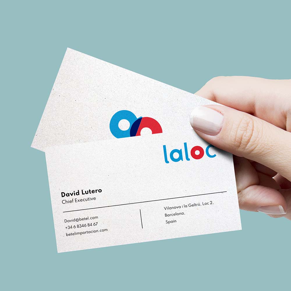
Logo design

Logo design

I designed a logo and stationery for «Laloc», a company that rents cars in Luxembourg. I chose to use the colours of the Luxembourg flag, a young and modern typography style, and to play with the «o» as if it were a car wheel. This play of the wheel with the «o» allows the logo to be more playful and to be able to play with the letter. For example, the «o» could spin in videos on social media, or make it jump from one side to the other. This dynamic gives more interaction with the customer, makes the brand more approachable and makes the customer feel more attracted to it.

Client:  Betel importation

Category: Graphic design